Peyman
[01]Many snacks. One family.
Every brand under one roof.
A website design concept for Peyman, one of Turkey's best-known nut and snack brands.
Peyman's range spans product families with very different personalities, from Nutzz to Bahçeden and Pop Corn. The concept gives each family its own colour and mood while keeping one navigation, one product language and one recognisable Peyman frame.
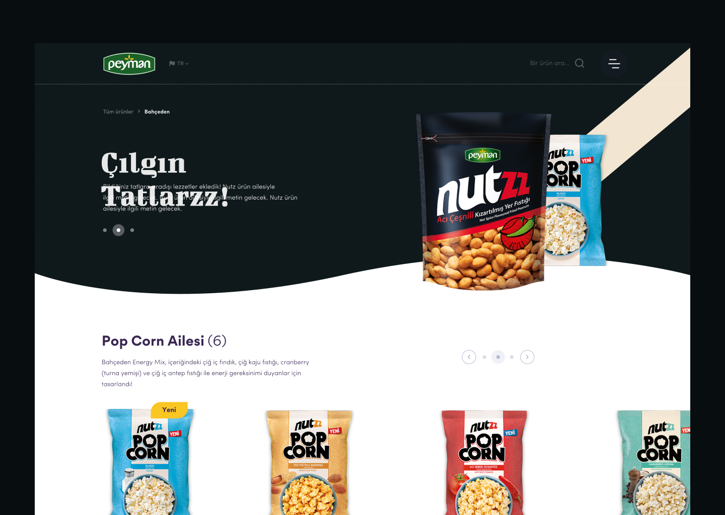
A colour for every craving.
Each product family takes over the page with its own colour: deep black for Nutzz, sky blue for Pop Corn, purple for Bahçeden. Floating ingredients, cut-out packs and soft curved dividers keep the pages lively without losing clarity.
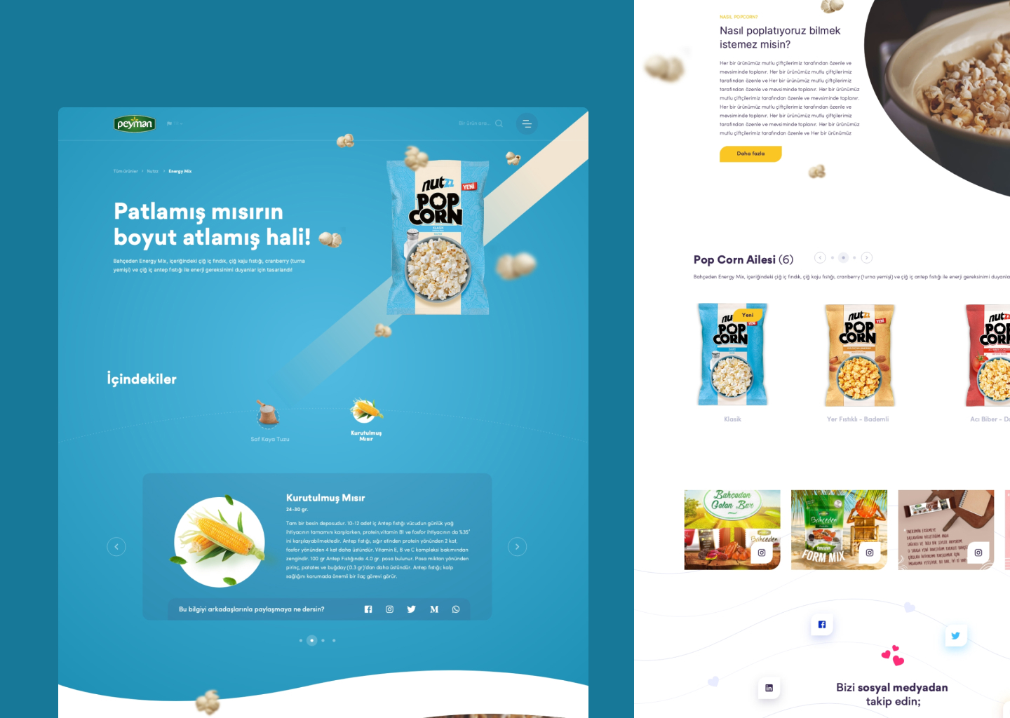
A concept, in motion.
Our role was the design concept. We designed the homepage, product family and product detail pages, and prototyped the interactions so the team could see ingredients drift, packs settle and sections flow before any development began. Development was outside our scope.
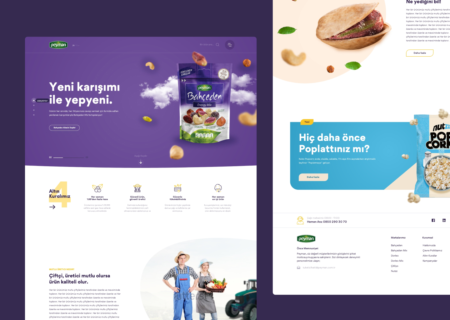
Appetite is a design brief.
Food is bought with the eyes first. Treating every pack and ingredient like a hero image turns a large catalogue into something people actually want to browse.
happen ↗